StudySmarter
A mobile learning app that identifies your learning type: then adapts every screen, format, and daily habit to match. Built on multimedia learning theory. Designed to make personalisation feel effortless.
ROLE
Solo UX/UI Designer
Type
Mobile , iOS, EdTech
CONTEXT
15 weeks (2024)
Redesign 2026
TOOLS
Figma, ProtoPie

PROBLEM 01/07
ONE-SIZE CONTENT
Same format for every user regardless of how they actually learn
NO PERSONALISATION SIGNAL
Apps have no mechanism to understand the individual before serving content
PASSIVE CONSUMPTION
Reading and watching are mistaken for learning. Active recall is rarely enforced.
LOW RETENTION
Without spaced repetition and habit loops, learned content fades within days
RESEARCH FOUNDATION 02/07
The design decisions in StudySmarter are not based on intuition alone. The project was informed by The Cambridge Handbook of Multimedia Learning (Mayer, ed.), specifically the Dual-Coding Theory and the Cognitive Architecture model: both establish why the same content must be presented differently depending on how a learner processes information.
THEORY 01
DUAL-CODING THEORY
Text and image are processed by separate
cognitive channels
People learn more effectively when verbal and visual information are presented together rather than separately. This directly informed the decision to build three distinct content formats: text, interactive illustration, and video, rather than one universal format.
Source: The Cambridge Handbook of Multimedia Learning, 2nd ed., Cambridge University Press.
THEORY 02
COGNITIVE ARCHITECTURE (MAYER)
Working memory has limited capacity — format determines cognitive load
Overloading one cognitive channel causes learning to fail. The quiz-first approach ensures the app routes each user to the format that uses their stronger channel: reducing extraneous load and increasing retention.
Source: The Cambridge Handbook of Multimedia Learning, 2nd ed., Cambridge University Press.
DESIGN APPROACH 03/07
The app identifies learning type through a short Multiple-Choice quiz, then adapts content format, study method, flashcard type, and daily missions to match. The quiz is not onboarding friction. It is the product's first value delivery: the moment a user feels understood before they have studied a single thing.
Step 01
Learning type quiz
Short MC test. Eight questions identify whether the user is text-based, interactive, or multimedia.
Step 02
Result & explanation
"You are a text-based learning type." Affirming identity language, not a score or percentage.
Step 03
Personalised content
Same topic, different format. Text learners get prose. Interactive get illustration. Multimedia get video.
Step 04
Habit: streak & missions
Daily missions create a bounded goal. The streak rewards consistency, not performance.
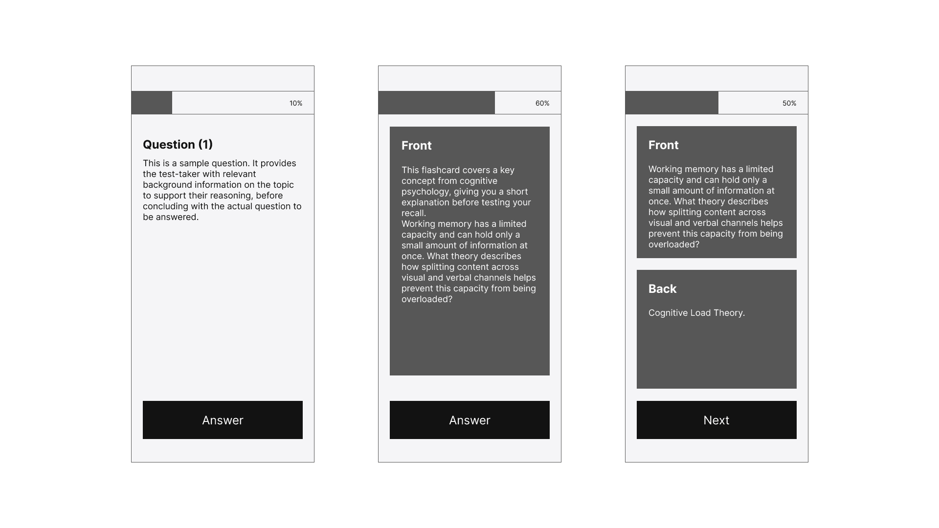
The user flow mapped the decision logic first, including where a lesson repeats when a learner answers incorrectly, before the wireframes translated that logic into screen-level structure.

Three early structural concepts for the flashcard screen, tested against the existing quiz layout to see which best separates the question prompt from the reveal, while keeping progress and navigation consistent across the flow.
DESIGN 04/07
Most onboarding asks for an email. StudySmarter asks "How do you think?" This turns a normally skipped step into the moment users first feel understood by the app. Around eight questions are enough to route reliably without causing drop-off.
Quiz before content
Personalisation signal collected upfront, not guessed over weeks of usage.
8 questions max
Enough to route reliably. Every extra question loses users at onboarding.
Identity language
"You are a text-based learner" not "your score is 76%." Affirming, not evaluative.
Every piece of content, in this case the Vegetation Zones of a lake ecosystem, is produced in three formats. Text-based learners receive structured prose. Interactive learners explore an annotated illustration. Multimedia learners watch a video. The underlying knowledge is identical; the cognitive channel is not.


Text learners process written information more effectively.
Content is structured as a readable summary with bullet-point notes, matching the cognitive preference identified in the quiz.
Interactive learners engage through spatial exploration.
The illustrated cross-section with clickable labels turns passive reading into active discovery: consistent with Dual-Coding Theory.
Multimedia learners integrate audio and visual simultaneously.
Video format activates both cognitive channels at once: the highest-retention format for this learning type per Mayer's cognitive architecture model.
Daily missions bound the study goal making it psychologically easier to start than open-ended study. The streak calendar rewards continuity: a user who studies 10 minutes every day retains more than one who studies 2 hours once a week.

Bounded daily missions
"Complete 5 flashcards" is psychologically easier to initiate than "study." Reduces initiation friction by defining done.
Streak over score
Rewards consistency, not performance. The metric reinforces the behaviour that actually produces long-term learning.
Visual foundations 05/07
Bricolage.
Warm neutrals.
Four rooms.

WHY BRICOLAGE:
THE FONT DECISION
A characterful display face with softly humanist curves, paired with Inter for UI. Distinct from the generic geometric sans-serifs that dominate EdTech, without sacrificing legibility at small sizes.
WHY WARM NEUTRALS:
THE COLOUR DECISION
Four muted room tints, sage, ice blue, apricot, lilac, each tied to a mental state of the user. Green for learning, blue for recall, orange for momentum, violet for identity. Lime is reserved globally for progress, giving the whole system one shared language.
WHY 8PT GRID:
THE SPACING DECISION
A calmer rhythm suited to mobile learning sessions. 8pt keeps components generous and legible without crowding, and scales cleanly across every card, button, and progress bar in the system.
Reflection 06/07
WHAT WORKED
The learning type quiz as the entry point was the right decision: it transforms onboarding from friction into the product's first value delivery. The earthy green palette differentiates the app immediately. The three-format content system is the most intellectually rigorous design decision in the project: grounded directly in Mayer's dual-coding research.
WHAT I WOULD DO DIFFERENTLY
Test whether eight quiz questions are enough to route reliably, or whether a 5-question quiz produces meaningfully better personalisation without causing drop-off. I would also explore whether learning type can evolve over time as habits change, rather than being fixed permanently at onboarding.
resources 07/07
Mayer, R.E. (ed.) (2014) The Cambridge Handbook of Multimedia Learning. 2nd ed. Cambridge: Cambridge University Press.
Available at: https://doi.org/10.1017/CBO9781139547369